How to Find Graphic Design Portfolio Templates That Actually Get You Hired
Securing a high-paying design role in 2026 requires more than a standard image grid. While graphic design jobs are projected to grow by 2% over the next decade, competition is intensifying due to AI-assisted workflows. To stand out, designers must choose templates that prioritize visual problem-solving over mere aesthetics.
Top approaches include:
- Web Builders: Adobe Portfolio (for Creative Cloud integration) and Framer (for high-end interactivity).
- Figma Community: Ideal for UI/UX-leaning designers who want granular control over layout logic.
- The Hybrid Workflow: Designing in Figma to export both a high-resolution PDF for HR portals and a live web link.
A portfolio template is merely a vessel; your ability to communicate visual problem-solving is the cargo. Many junior designers make the mistake of selecting heavily stylized templates that overshadow their actual work. In the current hiring landscape, recruiters and creative directors are looking for clarity, context, and a deep understanding of typography.
This comprehensive analysis will explore how to select, customize, and optimize graphic design portfolio templates to ensure your work is presented at a professional standard, avoiding common pitfalls that signal amateurism to hiring managers.
Which Platform Offers Top Graphic Design Portfolio Templates for Your Career?
The platform you choose dictates the constraints of your template. While some designers prefer the absolute freedom of a blank canvas, utilizing a structured builder can save weeks of development time. Below is a comparison of the most prominent platforms used by professionals today.
| Platform | Primary Strength | Cost Structure | Customization Level | Ideal User |
|---|---|---|---|---|
| Adobe Portfolio | Seamless Behance sync | Included with Creative Cloud | Moderate (Grid-focused) | Traditional graphic designers, photographers |
| Figma | Absolute layout control | Free tier available | Very High | UI/UX designers, hybrid workflow users |
| Framer | High-end web aesthetics | Subscription based | High (Requires learning curve) | Designers wanting interactive, modern web presence |
| Canva | Speed of deployment | Free / Pro tiers | Low to Moderate | Social media managers, absolute beginners |
| Format | High-resolution galleries | Subscription based | Moderate | Print designers, illustrators |
Adobe Portfolio: The Professional Standard for CC Users
For designers already paying for an Adobe subscription, Adobe Portfolio is widely regarded as one of the most practical choices. It is included at no additional cost with Creative Cloud and offers templates specifically engineered for visual creatives.
Its primary advantage is the direct integration with Behance. When you update a project on Behance, it can automatically sync to your Adobe Portfolio, ensuring your standalone website and your social design presence are always aligned. The templates here lean heavily toward clean, masonry-style grids that let the work breathe without excessive interface distractions.
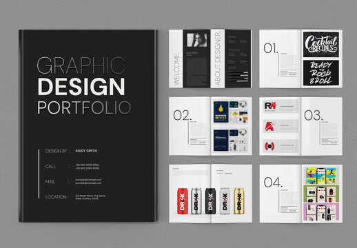
Image source: Adobe Stock
Figma: The Industry Favorite for Customization
Figma is not traditionally a website builder, but its community ecosystem has transformed it into a premier resource for portfolio creation. The Figma Community currently hosts over 2,800 portfolio-specific templates.
Designers favor Figma because it allows for absolute control over auto-layout, typography scales, and component states. Furthermore, a Figma template can be used to generate a highly polished PDF (crucial for corporate job applications) or exported to web builders like Framer or Webflow using dedicated plugins.
Canva: Speed vs. Professional Stigma
While Canva offers numerous portfolio templates, professional designers must navigate this platform with caution. In professional design circles and forums, there is a documented bias against portfolios that look like they were generated in Canva.
This is not necessarily a fault of the software itself, but rather how it is commonly used. Default Canva templates often rely on trendy, oversized graphics and generic font pairings that fail to demonstrate a designer's fundamental understanding of layout and hierarchy. If you choose to use Canva for its speed, you must heavily customize the typography and grid structure to elevate it to a professional standard.
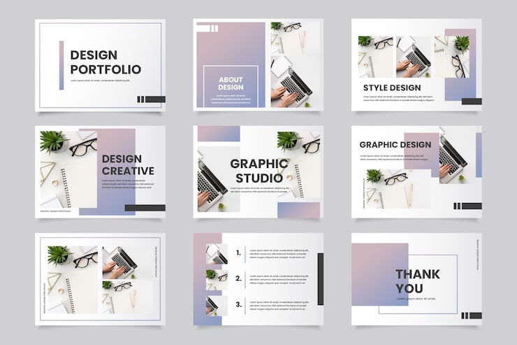
Image source: Magnific
How to Avoid Looking Like a "Canva Kid" When Using Templates
Industry veterans and recruiters frequently note that they can spot an amateur designer within seconds of opening a portfolio link. The issue is rarely the platform used to host the site; rather, it is the failure to customize the template's foundational design elements. To ensure your template serves as a professional vessel, you must address the following areas.
Typography is the Ultimate Tell
According to discussions on professional networks like the Graphic Design Forum and Sprout, typography is the primary indicator of a designer's skill level. Amateurs accept default template fonts; professionals curate them.
Never use the default font pairings that come with a free template. Instead, implement a deliberate typographic system. For example, pair a high-contrast serif like Playfair Display for headings with a highly legible geometric sans-serif like Inter or Roboto for body copy. Furthermore, manually adjust the line-height (leading) to 1.5 or 1.6 for body text to improve readability.
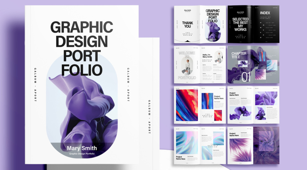
Image source: we and the color
Moving Beyond the Grid
A standard image grid is insufficient for a modern graphic design portfolio. While a grid is fine for a photographer, a graphic designer must demonstrate visual problem-solving. If your template only allows for a gallery of flat images, it is limiting your hireability.
You must select or modify templates that allow for deep case studies. Recruiters need to see the context of the work: What was the brief? Who was the target audience? What iterations were discarded? A template must have text-heavy sections integrated seamlessly with imagery to tell this story.
The Animation Warning
With the rise of tools like Framer and Webflow, there is a temptation to add complex scroll animations, parallax effects, and cursor trails to portfolio templates. Industry feedback strongly suggests keeping animation to a minimum.
Excessive "scroll-jacking" and heavy animations frustrate recruiters who are trying to quickly scan your work. Simplification makes the actual design stand out. If the website's interface is louder than the portfolio pieces, the template has failed its primary purpose.
A Hybrid Workflow for Creating Web and PDF Portfolios Simultaneously
A common point of confusion for emerging designers is whether to build a website or a PDF portfolio. The reality of the 2026 job market is that you need both. Many corporate HR portals (like Workday or Taleo) still require a file upload and will strip out external URLs from your application.
To avoid designing your portfolio twice, professionals utilize a "Hybrid Workflow" leveraging Figma.
The Figma-to-Everything Strategy
- Step 1: Select a Master Figma Template
- Begin by sourcing a comprehensive portfolio template from the Figma Community. Look for templates built with strict Auto-Layout rules, as this will make resizing and exporting much easier.
- Step 2: Design in "Frames"
- Structure your case studies within standard desktop frames (typically 1440px wide). Treat each frame as a "page" of a presentation. This forces you to pace your case study logically, balancing text and imagery.
- Step 3: Export for HR Portals
- Once your frames are complete, you can use Figma's native export tools or plugins like "Pitchdeck" to export the frames as a high-quality, multi-page PDF. Compress this PDF to under 10MB for email and portal applications.
- Step 4: Sync to the Web
- Instead of rebuilding the site from scratch, use the "Figma to Framer" plugin. This allows you to copy your exact layouts and paste them into Framer, where you can publish them as a live, responsive website with a custom domain.
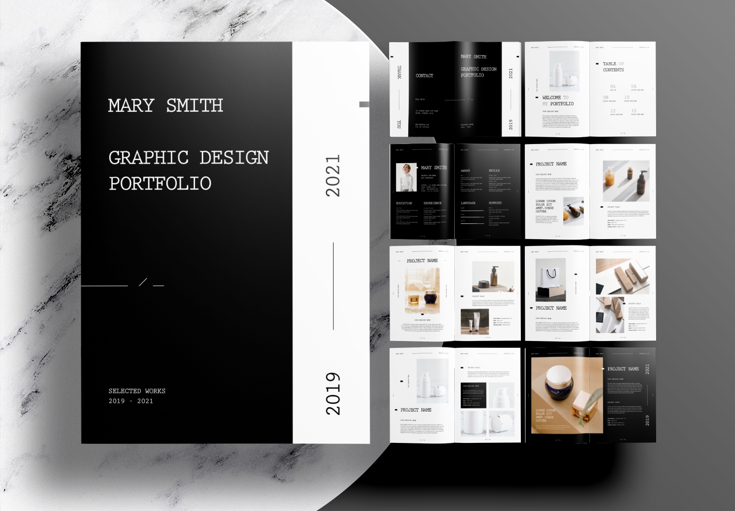
Image source: Unsell.Design
If you are transitioning into graphic design from another field (e.g., architecture, marketing, or fine art), you must carefully manage your template's navigation. Expert consensus advises strictly segregating non-design work. Mixing high-level architecture projects with junior-level graphic design can confuse recruiters. Use a template that allows for distinct, separate portfolios under one domain, or remove the non-relevant work entirely.
How to Use 3D Models to Make Your Portfolio Stand Out in 2026
Standard templates typically showcase flat images or static Photoshop mockups. While acceptable, this approach is becoming dated. To demonstrate a higher level of technical proficiency, especially in packaging or product design, integrating interactive 360° 3D models is a highly impactful strategy.
The Problem with Static Packaging Mockups
When a recruiter looks at a flat mockup of a box or a bottle, they cannot assess how the design wraps around the physical object. Real-time 3D rendering (like WebGL) is often too heavy for standard portfolio templates, causing massive delays in page loading times.
The Blender and Sirv Technical Workflow
To bypass loading issues while still providing an interactive experience, designers are utilizing a scripted image sequence workflow.
- Render in Blender: Create your packaging mockup in Blender 3D. Instead of exporting a single image, set up a camera to rotate 360 degrees around the object. Render this as a sequence of 36 to 72 individual JPEG frames.
- Upload to Sirv: Use an image hosting service like Sirv, which specializes in 360-degree product spins. Upload your image sequence.
- Embed the Viewer: Sirv will generate a lightweight iframe or JavaScript snippet. Paste this embed code into your portfolio template (supported by Adobe Portfolio, Webflow, and Framer).
The result is a responsive, touch-friendly 3D model that users can spin with their mouse or finger, loading just as fast as a standard image gallery. This technique sets a high standard for packaging presentation.
Essential Pages Every Graphic Design Portfolio Template Must Have
When evaluating templates, ensure they have pre-built layouts for the following essential pages. A template missing these structural elements will require significant manual coding or design work to fix.
The Case Study Page: The Heart of Your Portfolio
As established, curating your best work into deep case studies is vital. A strong case study template should naturally guide you through the following structure:
- The Problem Statement: A brief text block explaining the client's challenge.
- Research & Process: Space for wireframes, sketches, or mood boards.
- The Visual Solution: Large, high-resolution areas for the final polished designs.
- The Results: A section for metrics, client testimonials, or project impact.
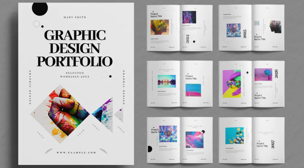
Image source: we and the color
The About Page: Selling the Designer
Recruiters hire people, not just portfolios. Your template must include a clean, professional About page. Avoid generic statements like "I love coffee and design." Instead, focus on your design philosophy, your technical stack, and your professional background. Include a high-quality, professional headshot—not a casual selfie.
The Contact Page: Reducing Friction
The goal of the portfolio is to get contacted. Ensure your template has a highly visible contact section. While contact forms are common, always include a direct, clickable email address (e.g., a mailto: link) as well. Many recruiters prefer to use their own email clients rather than filling out web forms.
How to Optimize Your Portfolio Template for Search Engines
Having a beautiful template is useless if art directors cannot find it. Search Engine Optimization (SEO) is often overlooked by visual creatives, but it is a critical component of a successful portfolio.
SEO for Designers
Recruiters frequently use Google to find local talent. If your template's H1 tag (the main heading) just says "Welcome to my portfolio," you are missing a major opportunity. Customize your template's headings to include targeted keywords. For example, change the H1 to read: "Jane Doe – Freelance Brand Identity Designer in Chicago."
Image Optimization
Search engines cannot "see" your design work; they rely on text. When uploading images to your template, never leave the file names as "Project1_Final.jpg". Rename the files descriptively (e.g., "organic-skincare-packaging-design.jpg"). Furthermore, meticulously fill out the Alt Text for every image in your template. This not only improves SEO but ensures your portfolio is accessible to screen readers.
Frequently Asked Questions
Is a PDF or website better for a graphic design portfolio?
How many projects should I include in my template?
Can I use a free template for a professional job application?
What is a highly recommended portfolio builder for beginners in 2026?
How do I protect my work from being stolen from my portfolio?
Final Thoughts: Choosing Your Template
A graphic design portfolio template is the foundation of your professional identity. It should elevate your work, not compete with it. When evaluating your options, keep these critical factors in mind:
- Prioritize typography: Ensure the template allows for custom font pairings and precise control over line height and kerning.
- Demand case study depth: Avoid templates that only offer masonry image grids; you need space for text to explain your visual problem-solving process.
- Check mobile responsiveness: A significant portion of recruiters will view your link on a mobile device; the template must scale flawlessly.
- Consider the hybrid approach: Choose a workflow (like Figma) that allows you to generate both a web link and a high-quality PDF for HR portals.
- Optimize for search: Select a platform that allows you to edit H1 tags, meta descriptions, and image alt text to improve your discoverability.
- Keep animations subtle: Avoid templates with heavy scroll-jacking or excessive motion that distracts from your core design work.